







































Olena_T
In this article I will outline why I think the apparel, accessories, and luxury goods manufacturer V.F. Corp. (NYSE:VFC) looks bullish to me using my technical analysis approach. VFC is known for its brands such as Dickies, Timberland, North Face, and JanSport among others. While I like some of those brands, I like the setup on the price chart below better.
Chart 1 – VFC Weekly with 30-week EMA, Momentum, Volume, and Relative Strength
www.stockcharts.com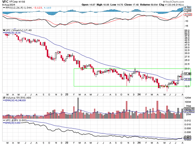
When I analyze a stock, I start with price action. I want to own stocks that are above a rising 30-week exponential moving average (EMA). The 30-week EMA serves as a reasonable medium to long term moving average that helps me better understand the trend of the stock. When the stock is trading higher than the moving average and the moving average is also trending higher that is bullish. Those are the stocks I want to own.
The ones I want to avoid or short are the stocks that are trading below their 30-week EMAs and their 30-week EMAs are trending lower. You can see in Chart 1 that VFC has spent the better part of the last three years trading below a downward trending 30-week EMA. That is all I needed to know to avoid buying VFC over the past three years. Now it looks like things have changed. VFC has perhaps put in a bottom in May at $10.93 and has worked itself higher. It now trades above its 30-week EMA and its 30-week EMA is starting to trend higher. VFC has traded four straight weeks above its 30-week EMA, something it hasn’t been able to do in the last three years. There is a concern about the price action of VFC. You can see that VFC has done well over the past few months, but it is still trading in a consolidation zone marked by the green box. Bulls want to see VFC break above this area of consolidation. All in all, I think the price action is bullish.
I want to own stocks with bullish momentum. To determine that I use the Percentage Price Oscillator (PPO) shown in the top pane of Chart 1. PPO can be used to determine short term and long term bullish or bearish momentum. When the black PPO line is above the red signal line that is an indication of short term bullish momentum. That is what VFC is showing now. Also, when the black PPO line is above the zero level or centerline of the chart, that is an indication of having long term bullish momentum. With a reading of 1.044, the black PPO line is above zero. Short term bearish momentum and long term bearish momentum have the opposite characteristics. Note the importance of the long term momentum. During VFC’s long decline below the 30-week EMA, the black signal line stayed below zero the entire time. Now that long term momentum has shifted to being bullish. I think momentum is bullish for VFC.
When I analyze volume, I look to see if institutional money managers are buying or selling the stock. I want to own stocks that the so-called smart money is buying. They often leave tracks that we can see if we pay attention. The big volume spikes we see in the volume pane of Chart 1 show smart money buying or selling. Big red spikes mean shares traded on a down day for the stock. Big black spikes mean shares traded on a day the stock advanced. The spikes show smart money buying or selling a lot of shares. Retail traders such as I don’t have enough money to buy millions of shares. I want to buy stocks that have more big black spikes than big red spikes. Over the past four weeks, smart money has been buying shares of VFC. They will only do that if they think VFC is undervalued. Even the big red volume spike that coincided with the low back in May looks bullish to me because VFC closed that week well above its lows for the week meaning smart money was accumulating shares at that level. Volume looks bullish to me as I think smart money has been accumulating shares in VFC.
The last technical tool I use when analyzing a stock is relative strength. I want to own stocks that are outperforming the SP 500 index. The relative strength indicator helps me do that. When the black line is declining that means that the stock is underperforming the SP 500 index. Conversely, when the black line is rising that means the stock is outperforming the SP 500 index. You can see that VFC has underperformed the SP 500 index for most of the past three years. Now that appears to be changing. VFC has done well against the SP 500 index since May and may continue to do so. Relative strength appears to be improving.
This analysis can be wrong for any number of reasons. VFC can quickly lose all its recent gains due to some accounting malfeasance. The broad market could sell off due to Federal Reserve policy or due to some geopolitical event. My point is, it is important to have a stop loss when you take a position. I always have a stop loss because I would rather take a small loss than end up holding the stock and losing 50% or more of my capital. Note the large decline in VFC from March 2022 to May 2024. Small losses are easier to recoup than 50% losses. When I look at the chart, I see a protentional stop loss on any close below the 30-week EMA or below the $14 level. You can also minimize your risk by scaling into a position. If taking a position in VFC, you can take a partial position now and look to see if VFC continues to do well. Then you can add to the position if VFC breaks above the green box.
In summary, price action looks bullish as VFC is trading above its upward trending 30-week EMA and has held above the 30-week EMA for four straight weeks. Momentum is bullish in both the short term and the long term. Volume analysis shows that smart money has been accumulating shares. Relative strength looks like it is improving. If you decide to take a position in VFC, remember to consider using a stop loss.
Credit: Source link