





































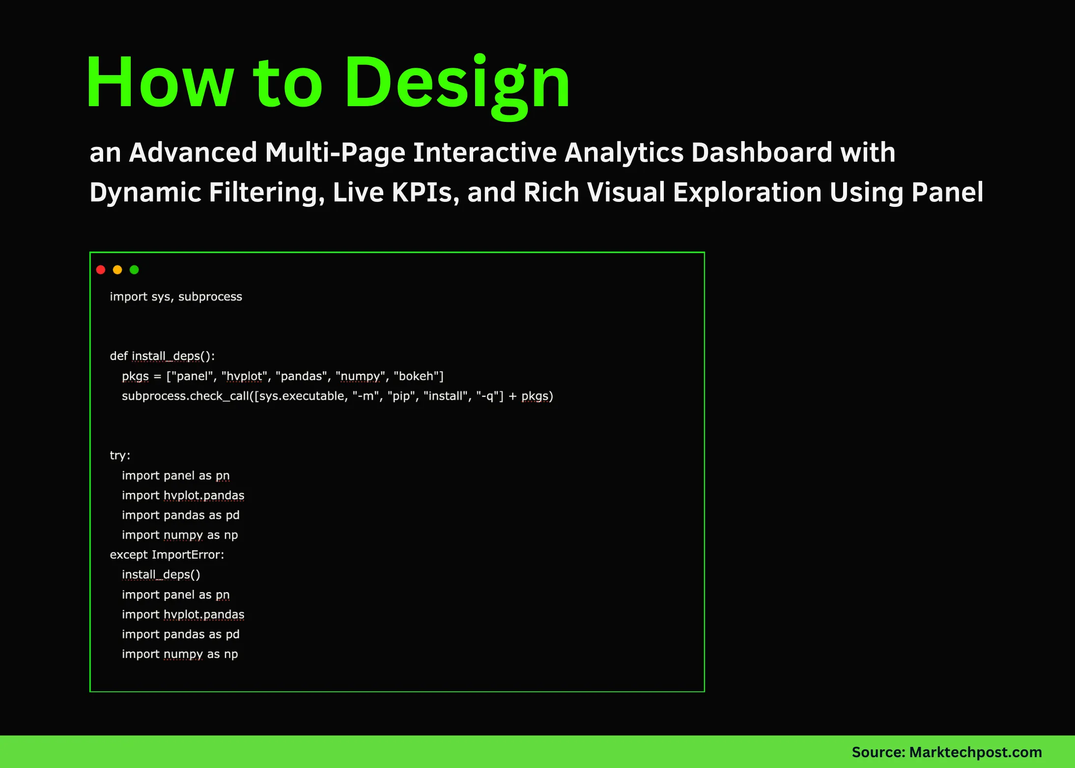

In this tutorial, we build an advanced multi-page interactive dashboard using Panel. Through each component of implementation, we explore how to generate synthetic data, apply rich filters, visualize dynamic time-series trends, compare segments and regions, and even simulate live KPI updates. We design the system step by step so we can truly understand how each widget, callback, and plotting function comes together to create a smooth, reactive analytics experience. Check out the Full Codes here.
import sys, subprocess


def install_deps():
   pkgs = ["panel", "hvplot", "pandas", "numpy", "bokeh"]
   subprocess.check_call([sys.executable, "-m", "pip", "install", "-q"] + pkgs)


try:
   import panel as pn
   import hvplot.pandas
   import pandas as pd
   import numpy as np
except ImportError:
   install_deps()
   import panel as pn
   import hvplot.pandas
   import pandas as pd
   import numpy as np


pn.extension()


rng = np.random.default_rng(42)
dates = pd.date_range("2024-01-01", periods=365, freq="D")
segments = ["A", "B", "C"]
regions = ["North", "South", "East", "West"]


base = pd.DataFrame(
   {
       "date": np.tile(dates, len(segments) * len(regions)),
       "segment": np.repeat(segments, len(dates) * len(regions)),
       "region": np.repeat(np.tile(regions, len(segments)), len(dates)),
   }
)
base["traffic"] = (
   100
   + 40 * np.sin(2 * np.pi * base["date"].dt.dayofyear / 365)
   + rng.normal(0, 15, len(base))
)
trend = {"A": 1.0, "B": 1.5, "C": 2.0}
base["traffic"] *= base["segment"].map(trend)
base["conversions"] = (base["traffic"] * rng.uniform(0.01, 0.05, len(base))).astype(int)
base["revenue"] = base["conversions"] * rng.uniform(20, 60, len(base))
df = base.reset_index(drop=True)
We install all required dependencies and load Panel, hvPlot, Pandas, and NumPy so the dashboard runs smoothly in Colab. We generate a full year of synthetic time-series data across segments and regions, providing a rich dataset for exploration. By the end of this block, we will have a clean, ready-to-use dataframe for all upcoming visualizations. Check out the Full Codes here.
segment_sel = pn.widgets.CheckBoxGroup(name="Segment", value=segments[:2], options=segments, inline=True)
region_sel = pn.widgets.MultiChoice(name="Region", value=["North"], options=regions)
metric_sel = pn.widgets.Select(name="Metric", value="traffic", options=["traffic", "conversions", "revenue"])
date_range = pn.widgets.DateRangeSlider(
   name="Date Range",
   start=df["date"].min(),
   end=df["date"].max(),
   value=(df["date"].min(), df["date"].max()),
)
smooth_slider = pn.widgets.IntSlider(name="Rolling Window (days)", start=1, end=30, value=7)


def filtered_df(segment, region, drange):
   d1, d2 = drange
   mask = (
       df["segment"].isin(segment)
       & df["region"].isin(region or regions)
       & (df["date"] >= d1)
       & (df["date"] <= d2)
   )
   sub = df[mask].copy()
   if sub.empty:
       return df.iloc[:0]
   return sub


@pn.depends(segment_sel, region_sel, metric_sel, smooth_slider, date_range)
def timeseries_plot(segment, region, metric, window, drange):
   data = filtered_df(segment, region, drange)
   if data.empty:
       return pn.pane.Markdown("### No data for current filters")
   grouped = data.sort_values("date").groupby("date")[metric].sum()
   line = grouped.hvplot.line(title=f"{metric.title()} over time", ylabel=metric.title())
   if window > 1:
       smooth = grouped.rolling(window).mean().hvplot.line(line_width=3, alpha=0.6)
       return (line * smooth).opts(legend_position="top_left")
   return line
We build the interactive widgets and the filtering logic that controls the entire dashboard. We wire the time-series plot to the widgets using reactive @pn.depends, letting us change segments, regions, metrics, date ranges, and smoothing windows instantly. With this setup, we can switch perspectives fluidly and see the effects in real time. Check out the Full Codes here.
@pn.depends(segment_sel, region_sel, metric_sel, date_range)
def segment_bar(segment, region, metric, drange):
   data = filtered_df(segment, region, drange)
   if data.empty:
       return pn.pane.Markdown("### No data to aggregate")
   agg = data.groupby("segment")[metric].sum().sort_values(ascending=False)
   return agg.hvplot.bar(title=f"{metric.title()} by Segment", yaxis=None)


@pn.depends(segment_sel, region_sel, metric_sel, date_range)
def region_heatmap(segment, region, metric, drange):
   data = filtered_df(segment, region, drange)
   if data.empty:
       return pn.pane.Markdown("### No data to aggregate")
   pivot = data.pivot_table(index="segment", columns="region", values=metric, aggfunc="sum")
   return pivot.hvplot.heatmap(title=f"{metric.title()} Heatmap", clabel=metric.title())
We construct additional visual layers: a segment-level bar chart and a region-segment heatmap. We let these charts react to the same global filters, so they update automatically whenever we make a selection. This gives us a deeper breakdown of patterns across categories without writing redundant code. Check out the Full Codes here.
kpi_source = df.copy()
kpi_idx = [0]


def compute_kpi(slice_df):
   if slice_df.empty:
       return 0, 0, 0
   total_rev = slice_df["revenue"].sum()
   avg_conv = slice_df["conversions"].mean()
   cr = (slice_df["conversions"].sum() / slice_df["traffic"].sum()) * 100
   return total_rev, avg_conv, cr


kpi_value = pn.indicators.Number(name="Total Revenue (window)", value=0, format="$0,0")
conv_value = pn.indicators.Number(name="Avg Conversions", value=0, format="0.0")
cr_value = pn.indicators.Number(name="Conversion Rate", value=0, format="0.00%")


def update_kpis():
   step = 200
   start = kpi_idx[0]
   end = start + step
   if start >= len(kpi_source):
       kpi_idx[0] = 0
       start, end = 0, step
   window_df = kpi_source.iloc[start:end]
   kpi_idx[0] = end
   total_rev, avg_conv, cr = compute_kpi(window_df)
   kpi_value.value = total_rev
   conv_value.value = avg_conv
   cr_value.value = cr / 100


pn.state.add_periodic_callback(update_kpis, period=1000, start=True)
We simulate a rolling stream of KPIs that update every second, creating a live-dashboard experience. We compute total revenue, average conversions, and conversion rate inside a sliding window and push the values to Panel’s numeric indicators. This lets us observe how metrics evolve continuously, just like a real monitoring system. Check out the Full Codes here.
controls = pn.WidgetBox(
   "### Global Controls",
   segment_sel,
   region_sel,
   metric_sel,
   date_range,
   smooth_slider,
   sizing_mode="stretch_width",
)


page_overview = pn.Column(
   pn.pane.Markdown("## Overview: Filtered Time Series"),
   controls,
   timeseries_plot,
)


page_insights = pn.Column(
   pn.pane.Markdown("## Segment & Region Insights"),
   pn.Row(segment_bar, region_heatmap),
)


page_live = pn.Column(
   pn.pane.Markdown("## Live KPI Window (simulated streaming)"),
   pn.Row(kpi_value, conv_value, cr_value),
)


dashboard = pn.Tabs(
   ("Overview", page_overview),
   ("Insights", page_insights),
   ("Live KPIs", page_live),
)


dashboard
We assemble all components into a clean multi-page layout using Tabs. We organize the dashboard into an overview page, an insights page, and a live-KPI page, making navigation simple and intuitive. With this structure, we get a polished, interactive analytics application ready to run directly in Google Colab.
In conclusion, we see how seamlessly we can combine Panel widgets, hvPlot visualizations, and periodic callbacks to build a powerful analytics dashboard. We appreciate how every module, from filtering logic to bar charts to the live KPI stream, fits together to produce a cohesive multi-page interface that runs effortlessly. We finish with a complete, interactive system that we can extend into real-world reporting, experimentation, or production-grade dashboards.
Check out the Full Codes here. Feel free to check out our GitHub Page for Tutorials, Codes and Notebooks. Also, feel free to follow us on Twitter and don’t forget to join our 100k+ ML SubReddit and Subscribe to our Newsletter. Wait! are you on telegram? now you can join us on telegram as well.
Asif Razzaq is the CEO of Marktechpost Media Inc.. As a visionary entrepreneur and engineer, Asif is committed to harnessing the potential of Artificial Intelligence for social good. His most recent endeavor is the launch of an Artificial Intelligence Media Platform, Marktechpost, which stands out for its in-depth coverage of machine learning and deep learning news that is both technically sound and easily understandable by a wide audience. The platform boasts of over 2 million monthly views, illustrating its popularity among audiences.
Credit: Source link